If you want people to get your message, plain language and smart design are key. Our last post, The Power of Plain Language, spoke about why plain language matters and how it can help you communicate more effectively.
We also introduced you to the Plain Language Association International (PLAIN), whose membership is committed to promoting clear communication in any language. They set the bar for the rest of us to follow.
Building on our last post, this post is all about Information Design—organizing your message so it makes sense right away. When you put plain language and good design together, your ideas are way easier for people to spot, understand, and act on.


Information design is about organizing your content, so it’s easy for people to find, read, understand, and use. Instead of dumping all your information in a big block of text, you break things up, use visuals, and guide your reader step by step. It’s what turns raw data into something people can use, transforming facts and figures into insights that make sense.
PLAIN describes clear communication the following way:
“A communication is in plain language if its wording, structure, and design are so clear that the intended audience can easily find what they need, understand what they find, and use that information."
Notice that “design” is right there alongside “wording” and “structure”. The association includes design as a key part of plain language, because how your message looks is just as important as the words you choose.
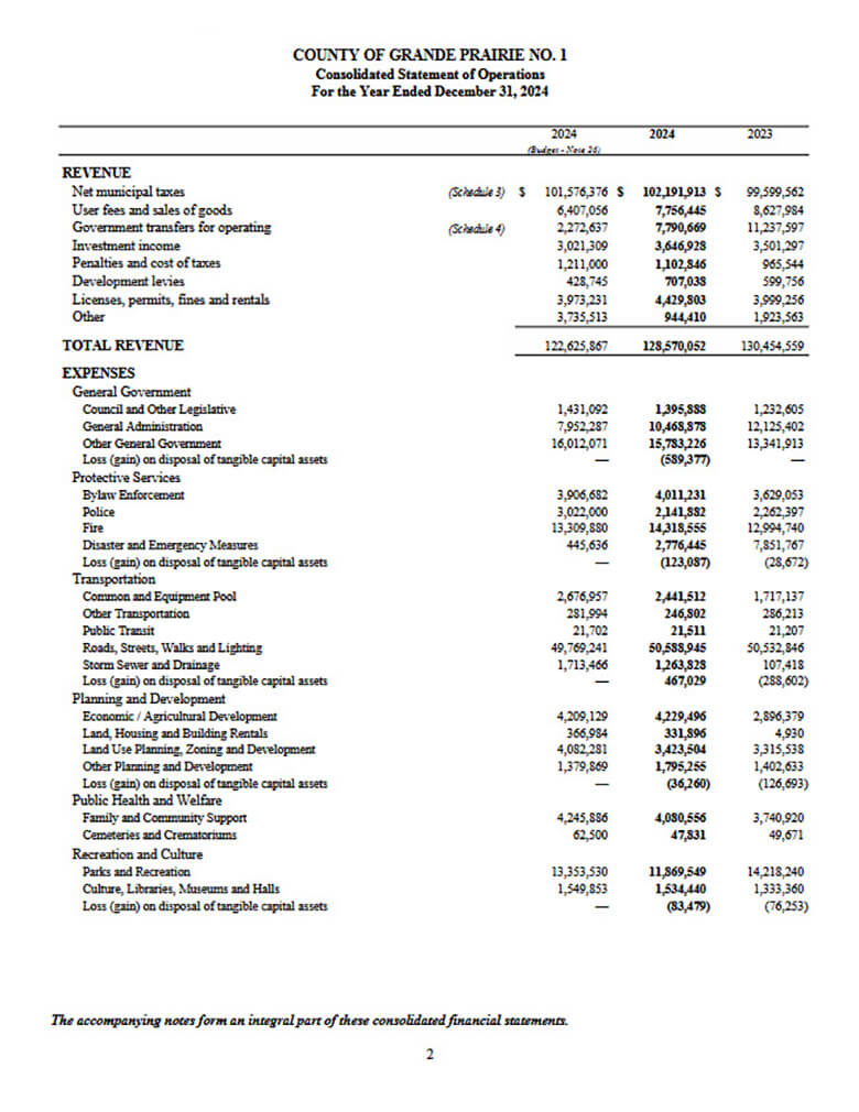
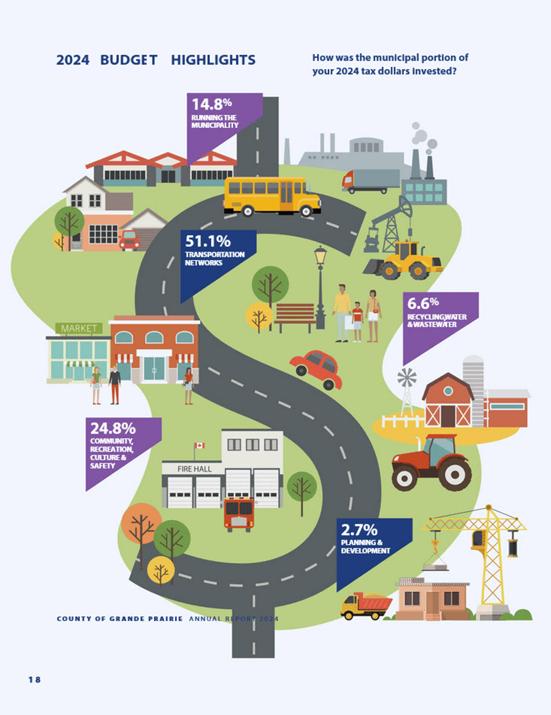
Think about a financial statement laid out as a dense spreadsheet versus an infographic that highlights the key numbers and trends. Which one would you rather read?
The people you’re hoping to reach should be at the centre of everything you do. So, before you put pen to paper, or fingers to keyboard, it’s smart to stop and ask yourself a few key questions to help you stay focused on them.
Here are some must-ask questions that will set you up for audience-centred communication:
When you design and write with your readers in mind, you help them find what they need faster and feel more confident taking action. That’s the heart of good information design and plain-language communication.
When designing your information, try the following:
When you’re putting together your slides, keep things simple and easy to follow.
When it comes to designing emails, remember that sending and receiving messages is a big part of our work. Emails can easily be misunderstood, so take a moment to say what you really mean and keep things straightforward.
Even though emails are often rushed through or overlooked, they’re still important documents, so use plain language to make sure your message gets across clearly.
After you’ve put your message together, take a step back and review it. Read it aloud. Does anything sound awkward or confusing? Ask someone else to look it over. Feedback from others can catch things you’ve missed and show you where your message isn’t clear.
There are also great tools and AI editors that help spot hard-to-read sentences or jargon. If you’re working on a website or a report, usability testing can be a game-changer. It lets you see how real people interact with your content and where they stumble.
Combining plain language with thoughtful design can transform how people receive your message. Whether you’re writing, speaking, or creating digital content, these principles help ensure your ideas are clear, accessible, and actionable.
Give it a try, your audience will thank you!

We live, work, and gather on traditional, unceded, and treaty territories of First Nations, Métis, and Inuit Peoples from coast to coast to coast. We’re committed to our collective responsibility to the original caretakers of this land and to listening, learning, and acting in ways that support reconciliation.